rgb

http://www.stumbleupon.com/su/1Y15Iu/:V8gfFn2!:d1sdf$0y/www.thisiscolossal.com/2012/09/tauba-auerbachs-rgb-colorspace-atlas-depicts-every-color-imaginable/

The design is RGB colorspace atlas that contains digital offset prints of every variation of RGB color possible. Basically it is a three dimensional design of what photoshop has to offer you except in a physical 8 by 8 in cube. I think that concept is very cool showing what photoshop has to offer in real life form, it is a great idea and when flipping through the pages gives you different colors. 

Posted in Uncategorized | Leave a comment

hidden logos

http://www.stumbleupon.com/su/2apnVP/:ibyOvf+!:bl8v+hC@/list25.com/25-famous-logos-with-hidden-images/

This sight has 25 examples of logos that all have hidden images in the their name. my favorite is the FedEx, every time that that i see the logo i automatically look at the arrow. In addition i like the Baskin Robins showing the 31 flavors that make up their slogan for selling a product. all in all the use of having a hidden image makes the viewing audience look closely at your logo as well as automatically recognizing the design and what your company is about.   

Posted in Uncategorized | Leave a comment

hand lettering

http://www.stumbleupon.com/su/2yPfGD/:iSlx$KTM:bl8v+hC@/www.typographyserved.com/gallery/The-Lost-Art-of-Hand-Lettering/2716969/

this site shows a great process of something that completely unique to todays society with new and cutting edge technology. This site uses rudimentary letter forming to create hand drawn lettering that is both aesthetically pleasing as well as functional. the composition reminds me of the wild west were everything is written in long and cursive letters showing depth of time. 


Posted in Uncategorized | Leave a comment

Second base

Second base

This design is ingenious, in order to get the very last drop of soup or milk from your bowl. the problem that could happen is if a full bowl is moved to the tilted position by accident and spills  the contents all over. The bowl looks to be very modern in design having delicate yet firm edges giving it a great overall stability with function.

Posted in Uncategorized | Leave a comment

shadow art

Image


what i like about the shadow art presented here is how the image is being created. Using simple objects and lighting with far from simple planning. Using different length size and width blocks come together to form a silhouette of a woman. I think that the idea and design had to take a long time in order to produce as well as construct. All in all the concept is amazing producing a great silhouette. 

Posted in Uncategorized | Leave a comment

graphic design interview

graphic design interview

when i read the article about how to act and what is best proccedure for showcasing your art work to the employer. A lot of what is said is rather common sense yet some ideas are very smart ideas that i would not have thought about. such as bringing a pad of paper to show that u might take notes as well as showing that you are organized.

Posted in Uncategorized | Leave a comment

witty illustrations

Image


The artist Chow Hon Lam brings together a unique and witty illustration that captivates you with the forethought and ingenuity of his design and creation. Also what i like about the design and concept is the simplicity that is involved in order to get his message across to the viewer. 

Posted in Uncategorized | Leave a comment

legos and art

Image


the overal design and concept that is needed in order to make these life size people out of legos must have taken hours upon hours of planing as well as hours in the actual construction. I like the attention to detail that is needed in order to be able to complete such a project, by using the legos for the construction of the people is also like the building blocks that make up our own identity. 

Posted in Uncategorized | Leave a comment

http://www.stumbleupon.com/su/1QGKJD/:i.2@QR4D:aNZKYAYl/www.andrewkeir.com/overused-logo-design-ideas/

http://www.stumbleupon.com/su/1QGKJD/:i.2@QR4D:aNZKYAYl/www.andrewkeir.com/overused-logo-design-ideas/

This web sight is about how a graphic designer looks at a logo and tries to make the image more unique as well as visually appealing to the viewer. By questioning the design of the logo  that this sight has as an example shows how the overall concept changes by very little tweeks allowing to give a new concept to the company. 

Posted in Uncategorized | Leave a comment

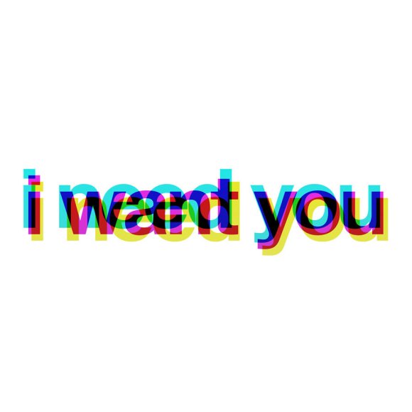
i want you

Image


i like the concept of this because it has different messages throughout the sentence. The eyes perception when looking and studying this image makes you feel light headed or sick. Yet if you can gut it out you are able to see that the image is saying “i want you” “i need you” in different vibrant colors that irritate the eye yet through different opacity’s colors are pushed forward or recessed; so you are able to see the different words. 


Posted in Uncategorized | Leave a comment